01
Dense fund data made reading and switching harder
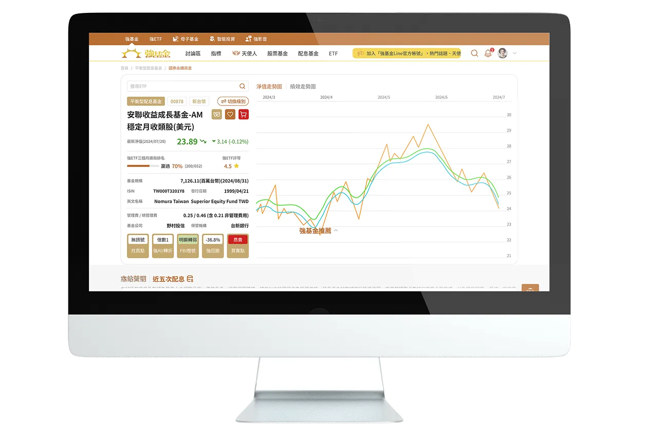
Fund pages carried many indicators and datasets at once. Presented together, they took users longer to interpret and made finding and switching between figures more laborious.
A more intuitive, context-aware fund investing community experience
Fundhot is a community platform built around mutual fund investing, offering fund data, market indicators, and investment discussion. As the platform's information and use cases kept growing, JoinX reorganised fund information, feature navigation, member management, and community browsing, and built context-specific interfaces such as “Office Mode” so complex fund data is easier to find, switch between, and use, while keeping the platform's community character.

BACKGROUND
Fundhot has long provided mutual fund information and investment discussion, and helps users read market sentiment through its proprietary FBI indicator (Fundhot Bias Index). As the platform accumulated more fund data, member features, and community content, the original interface had to carry ever more information at once. This project was therefore not just a visual redesign: it started from how users actually browse fund data, join discussions, and manage their profiles, and reorganised the platform's information architecture and interaction logic around those flows. • Development Motivation: As fund data, member features, and community content grew, existing pages became dense and entry points scattered, calling for a rethink of the overall experience. • Upgrade Goal: Let users reach the fund information and platform features they need faster, and establish browsing modes suited to different contexts. • Core Features: Tiered fund information, integrated feature navigation, Office Mode, member centre rebuild
CHALLENGES
With fund data, community content, and member features growing, the platform needed to rework how information is presented, where features live, and how different contexts are served, so that complex functionality still feels clear and intuitive.
01
Fund pages carried many indicators and datasets at once. Presented together, they took users longer to interpret and made finding and switching between figures more laborious.
02
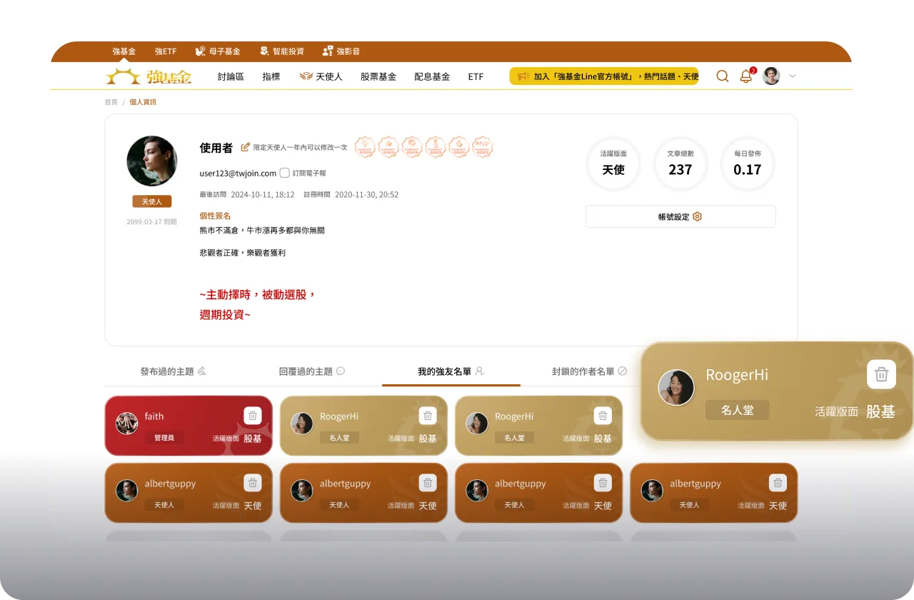
Everyday actions such as bookmarking and subscribing, along with history, account settings, and watchlists, lived in different places, adding steps to finding features and managing personal information.
03
Community members browse at different times and in different settings, but the existing interface had no mode tailored to specific scenarios. A more flexible, context-aware experience was needed.
SOLUTIONS
JoinX reworked the platform experience across information hierarchy, feature entry points, usage contexts, and member interactions, so users can find what they need intuitively without understanding a complex system structure.
Fund information was regrouped by content type and given tab-based switching, so users can pull up the data they need in the moment instead of reading everything on one page.
The header and primary feature placement were replanned, gathering frequent entry points such as bookmarks, subscriptions, and the Hall of Fame into one iconised area so key features are easier to find and use.
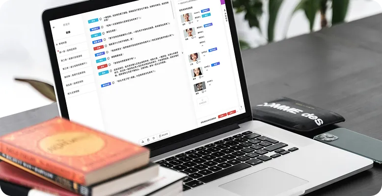
The discussion board was redesigned for office settings, presenting content in a form closer to slides and tables. It keeps the full set of community interactions while offering a way to browse that looks nothing like a typical forum.
History, account settings, and watchlists were brought together in the member centre, using a consistent page structure and tab switching to cut back-and-forth between pages.
TECH STACK
Beyond the redesign, the upgrade split fund information, member features, and usage contexts into independently manageable modules, so the platform keeps its existing services while staying flexible for later adjustments and extensions.
01
Different kinds of fund information became independent content modules presented through one consistent switching logic, preventing pages from piling up information and making later content changes easier.
02
Common entry points and member-related features across the platform were reorganised into a more consistent navigation and management structure, reducing the gaps that grow when features evolve separately.
03
An “Office Mode” interface was built alongside the existing community features, letting the same content be re-presented for different contexts while keeping discussion and interaction intact.
IMPACT
Tiering and switching reorganised fund data that used to be shown all at once, so users can focus on what they actually need right now.
With everyday features and member data integrated, users spend less effort hunting and switching between pages, and key features have clearer entry points.
“Office Mode” extended the community's usage contexts, and the modular reorganisation of fund information and member features leaves more room for future adjustments, expansion, and maintenance.
We'll work alongside you to bring your vision to life—let us help clarify your requirements!